First off I printed my base print - standard print which looked nice and punchy in the wash, deep blacks and good highlights. Next up I printed a second version, identical, and after a short wash I dried it in the microwave. The original, still wet print is on the right, the dried version on the left:
 |
| Both prints base exposure, left is after drying, right is wet. |
Big difference, eh? The dry version looks flat and horrible, with dull highlights. I'd say the dry-down here is 'significant' :)
So off I went on the dry-down challenge, making a series of prints with successively smaller amounts of exposure. I kept the contrast settings the same - grade 2.5. The timer I use works in 1/10 of a stop so the series below (left->right) shows dried prints at base, -0.2f, -0.3f and -0.4f. If you prefer seconds, base was 33.9s, then 29.1s, 26.9s and 24.9s:
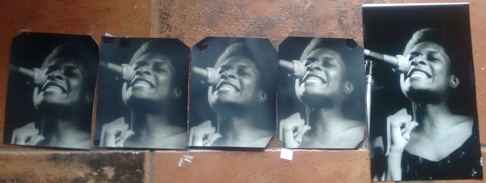 |
| Decreasing exposure from left to right (dry prints). On the right hand side is a wet print showing what I would like the final (dry) print to look like. I don't know why these have a blueish cast and the shot above has a brownish cast - must be my phone camera anomalies. |
I felt by -0.4f I was getting closer to the target. Although the black background wasn't looking so good, the highlights were coming good. Reading around the forums some people suggest a reduction in 1/2 a stop, more or less where I got to. Les McLean is a bit more conservative and reckons that an exposure reduction in the range 8-12% is more accurate (link here).
So, what's the point of all this? Two-fold, I guess. Firstly to give me an indication of what the reduction in exposure should be for the next negatives I print on this paper. Secondly, I'd actually like a bright, crisp print of Ms Rita Ray here! So where to next, then... I could run more tests varying the contrast and probably I should, but I took a bit of a detour at this stage and thought I'd see the effects of Pot Ferri and selenium toning - Pot Ferri to brighten the highlights a little more and selenium toning to deepen those blacks.
As much as for my own record as anything else, the Pot Ferri mix was 20ml of 10% PF with 640ml water, room temperature. Selenium was diluted 1+5 at about 25 degrees.
As expected the Pot Ferri wash had a significant effect on the highlights. Just to see, I did a print at -0.5f (the middle of the prints above). Perhaps I left it in the Pot Ferri too long but some detail has now been lost in the highlights, most noticeably in the singer's teeth. The print on the left got left a little long in the selenium and so a subtle reddish tone has developed, but it's not significant or unpleasant.
However, in spite of the selenium bath the prints have still lost some contrast so the next step is to do another couple of tests at a higher contrast to see how things pan out. That's the plan for tomorrow!
So, what's the point of all this? Two-fold, I guess. Firstly to give me an indication of what the reduction in exposure should be for the next negatives I print on this paper. Secondly, I'd actually like a bright, crisp print of Ms Rita Ray here! So where to next, then... I could run more tests varying the contrast and probably I should, but I took a bit of a detour at this stage and thought I'd see the effects of Pot Ferri and selenium toning - Pot Ferri to brighten the highlights a little more and selenium toning to deepen those blacks.
As much as for my own record as anything else, the Pot Ferri mix was 20ml of 10% PF with 640ml water, room temperature. Selenium was diluted 1+5 at about 25 degrees.
 |
| Left to right: -0.4f, -0.5f exposure reduction (with Pot Ferri & Selenium, after drying). Base print (wet) on the right. |
As expected the Pot Ferri wash had a significant effect on the highlights. Just to see, I did a print at -0.5f (the middle of the prints above). Perhaps I left it in the Pot Ferri too long but some detail has now been lost in the highlights, most noticeably in the singer's teeth. The print on the left got left a little long in the selenium and so a subtle reddish tone has developed, but it's not significant or unpleasant.
However, in spite of the selenium bath the prints have still lost some contrast so the next step is to do another couple of tests at a higher contrast to see how things pan out. That's the plan for tomorrow!
A very good guide, Michael! I knew I've seen this one before, so I had to look it up once again. So, it seems around -0,5 stop should do a fair bit to reduce the dry-down effect on this paper then. I think I have used something like that before, or maybe closer to -0,3 stop, but I have never done a good test to confirm which one is better. Anyway, you did it, so I don't have to :))
ReplyDeleteI guess a good old "Thank You" is the right thing to say! I mean for the great post with a good conclusion and such... and for the extensive use of papers, and for showing us the nice prints and the process :)
Thanks Roy. This was a real learning curve for me - I was surprised by the difference a simple 1/2 stop could make to the final print and it was something maybe only visible when you see the prints side-by-side. The trick is to remember that next time I'm using this paper :)
Delete